| 2000CheetahStud |
| (Post Master Supreme) |
| 03/18/15 03:40 PM |
|
|
|
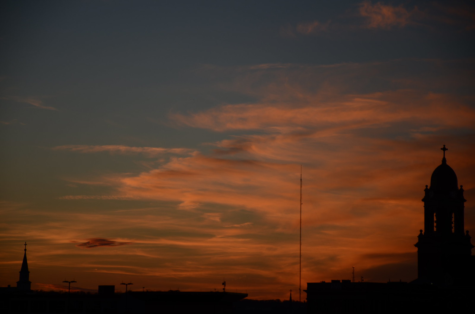
 Church Sunset by mgproudfit1, on Flickr
Nikon D7000
18-140
First time shooting a sunset with the new camera setup. I was driving home from my original location and saw the church silhouetted against the sky. The colors are untouched from original. I did an (admittedly) awful job on removing a cell tower in the middle of the pic but I was just using Pixlr (no PS yet). This was taken by hand (no tripod).
Why is there a vignette on the upper left and right corners?
| Duc |
| (Post Master Supreme) |
| 03/18/15 03:43 PM |
|
|
|
|
best bit of advice that I can give you that I've received from everyone on here is the rule of thirds. look it up. also by the book understanding composition
| Senor Eduardo_82 |
| (Post Master Supreme) |
| 03/18/15 04:01 PM |

|
|
|
I think Duc means this book:
http://www.amazon.ca/Understanding-Expos...anding+exposure
Also this one by the same author:
http://www.amazon.ca/Learning-See-Creati...26712508&sr=1-1
Tell us, in detail, how you took the shot.
| tylerdurden |
| (Post Master Supreme) |
| 03/18/15 04:04 PM |
|
|
Looks to be some weird cloning artifacts along the bottom middle?
| 2000CheetahStud |
| (Post Master Supreme) |
| 03/18/15 04:08 PM |
|
|
|
|
Setting "P"
1/250
F5.6
ISO 100
No tripod. I jumped out of the car, grabbed the camera, and took that, and a few others. I changed the exposure settings to get different colors in the sky.
| 2000CheetahStud |
| (Post Master Supreme) |
| 03/18/15 04:12 PM |
|
|
|
|
Here are two others, unedited, from the same position:
 DSC_0144 by mgproudfit1, on Flickr
 DSC_0139 by mgproudfit1, on Flickr
You can see the cell tower I edited out.
| 2000CheetahStud |
| (Post Master Supreme) |
| 03/18/15 04:18 PM |
|
|
|
|
 DSC_0139 by mgproudfit1, on Flickr
A little brightness/contrast went a long way on that pic.
| Huggy |
| (Post Master Supreme) |
| 03/18/15 04:36 PM |

|
|
|
I took the first unedited you posted and did a few quick things... Ignore the super fast removal of a few things, but I felt besides the tower the big lights needed to be removed as well.

I actually added a tick of exposure, felt they were too dark. Got ride of any color in the black of the church and shit... Then added some contrast. also did a tick of sharpening on the edges of the church and shit, very soft in the original sized images. I don't know, I hate editing jpg files... RAW for life!!!
| 2000CheetahStud |
| (Post Master Supreme) |
| 03/18/15 06:08 PM |
|
|
|
|
I ordered that book and got a tripod.
| tylerdurden |
| (Post Master Supreme) |
| 03/18/15 06:27 PM |
|
|
It sounds weird, but I honestly think the mood here would be suited to a reduction in saturation, it's less expected and I'm not loving the colors actually. Something a little more somber/low key.
| Kierf |
| (Post Master Supreme) |
| 03/18/15 06:45 PM |

|
|
|
You're an attractive guy with a stable job that unfortunately takes away from time at home. I'm looking for someone who's around more often.
...oh, the photos?
Framing and get rid of the cell tower.
| 2000CheetahStud |
| (Post Master Supreme) |
| 03/18/15 07:36 PM |
|
|
|
|
What framing adjustments would have made the pic better?
Full disclosure: There was a HUGE "HORSESHOE CASINO" sign just under the picture. I had to keep it up high enough to avoid that.
| Kierf |
| (Post Master Supreme) |
| 03/18/15 08:57 PM |
|
|
|
|
Originally Posted By: 2000CivicStud
What framing adjustments would have made the pic better?
Full disclosure: There was a HUGE "HORSESHOE CASINO" sign just under the picture. I had to keep it up high enough to avoid that.
Full disclosure: There was a HUGE "HORSESHOE CASINO" sign just under the picture. I had to keep it up high enough to avoid that.
Something like this.

| **DONOTDELETE** |
| () |
| 03/20/15 03:38 PM |
|
|
^Agreed, though it's subjective. The lower elements of yoru original photo are a little distracting and take away from the photo, but post processing will help immensely here. Even a gritty B&W would be cool.
| Kierf |
| (Post Master Supreme) |
| 03/20/15 04:05 PM |
|
|
|
|
Originally Posted By: tenplanescrashing
^Agreed, though it's subjective. The lower elements of yoru original photo are a little distracting and take away from the photo, but post processing will help immensely here. Even a gritty B&W would be cool.
| MetalheaD |
| (Post Master Supreme) |
| 03/25/15 09:34 PM |

|
|
|
Instead of cloning out that antenna, use spot healing brush in Photoshop. It's context-sensitive and it'll fill in the clouds in a random pattern instead of with those lines.
If you insist on cloning, use a much softer brush and it won't be so obvious.
| Kierf |
| (Post Master Supreme) |
| 03/26/15 12:29 AM |
|
|
|
|
It isn't obvious...because I didn't use cloning.
Seriously though, I didn't. I used context-aware filling. I can't remember what it's called. Highlight an area, delete it, use context-aware to fill it in. It was a 5 minute job at best.
| Nate047 |
| (Post Master Supreme) |
| 03/29/15 02:23 PM |
|
|
|
|
That looks like shit man lol. Come on.
Nate
| LNXGUY |
| (Post Master Supreme) |
| 03/29/15 07:46 PM |

|
|
|
| Kierf |
| (Post Master Supreme) |
| 03/29/15 08:19 PM |
|
|
|
|
Originally Posted By: Nate047
That looks like shit man lol. Come on.
Nate
Nate
Originally Posted By: Kierf - ż§?
Something like this.